
About your Lecturer

Kate Saunders
Lecturer at Monash University
👩🎓 PhD in Statistics
🌍 Home State is Queensland
👩💻 Research is in statistics of climate extremes
👨💻 Passionate about open data, data visualisation and data ethics
🧑💻 Started R coding in 2012 (before tidyverse!)
❤️ Hobby is playing real basketball and fantasy basketball.
About your Instructor

Bets Ruscoe
PhD Student at Monash University
👩🎓 Studied Econometrics at Monash
🎓 Worked at Deloitte in the AI & Data team, before coming back for PhD
🧑💻 Researches algorithmic bias
🎸 Plays bass guitar in a band
❤️ Making her way through all of Rebecca Kuang’s books
About your Instructor

Minh Nguyen
PhD Student at Monash University
🎓 Monash Actuarial Science undergrad, Hons. in Business Analytics, and now a PhD student in Data Vis
🌍 From Vietnam
👨💻 Previous jobs: pricing actuary, business analyst.
👨💻 Almost did fine arts degree, but found my canvas in data
❤️ Often in the campus centre playing piano and doing karaoke as a break
ETX2250 / ETF5922 Unit Developers
Most of the material in this unit was developed by Dr. Kate Saunders and Dr. Shanika Wickramasuriya
Kate Saunders

Shanika Wickramasuriya
But there have been many contributors to the unit design and teaching over the years.
Generative AI
You can use Generative AI in this unit.
In fact I encourage it!
It’s a great tool for those learning to code
Generative AI
You can use Generative AI in this unit.
In fact I encourage it!
It’s a great tool for those learning to code
But
You must never copy and paste output from AI you don’t understand or can not explain
You must always provide appropriate acknowledge of you AI use
You need to be careful not to short cut your learning
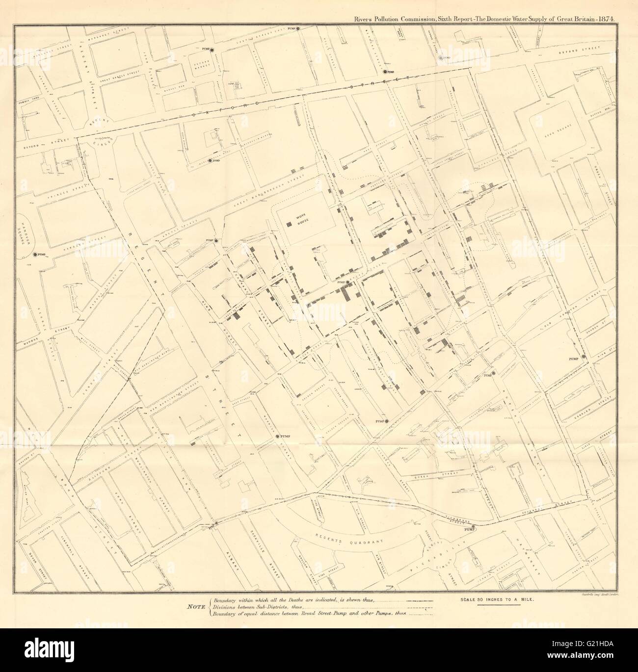
Original Map
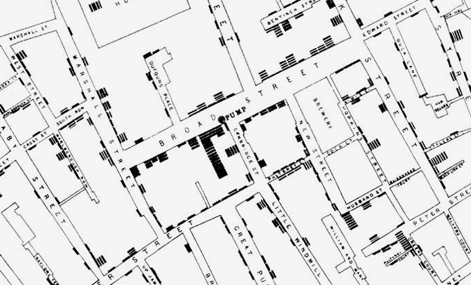
Close Up
Original Rose Chart

Recreation of Nightingale’s Rose chart

- Blue areas: Preventable deaths
- Red areas: Deaths from battle wounds
- Black areas: Other causes
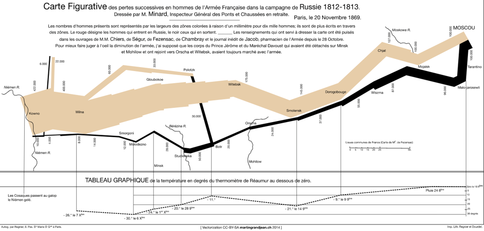
Minard’s Plot
Flattening the Curve
A visualisation showing the importance of slowing the spread and reduce the peak in cases (Source).

Warming Spiral
A visualisation showing the climate is warming.
This visualisation was shown at the Rio Olympics in 2016!

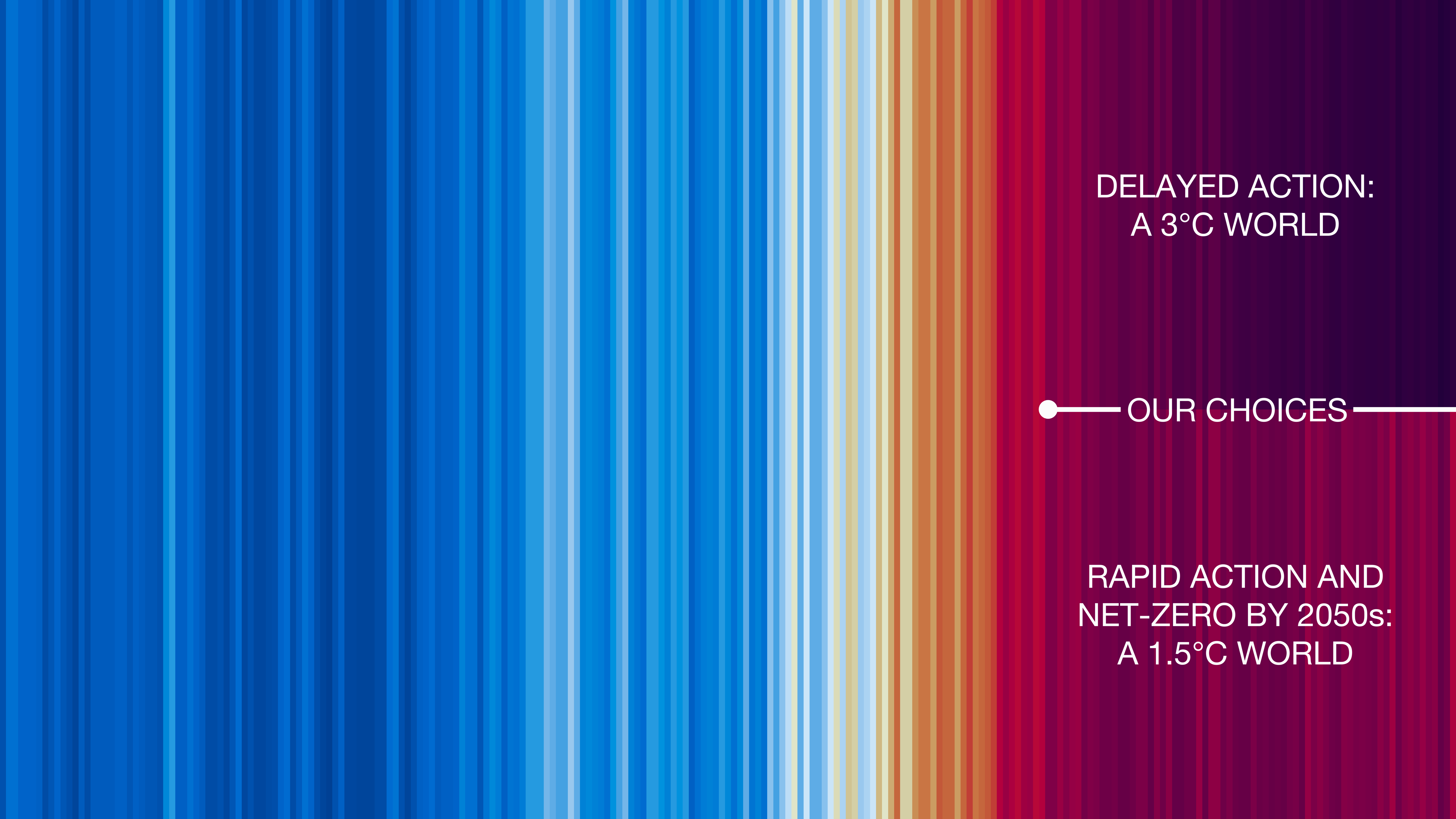
Future Climate
A visualisation showing that our choices today will impact our rate of future warming.
2024 US Elections: Polling
Voter Needle: Shows election results in context as they come in and displays the uncertainty in the total as votes are counted.
2025 Australian Federal Election: Spatial Trends
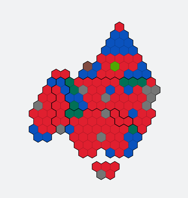
Tessalated Hexabin Maps: Show election result by district on a map
2024 US Elections: Demographics

2024 US Elections: Policy
And here is the chart credited with saving President Trump’s life.
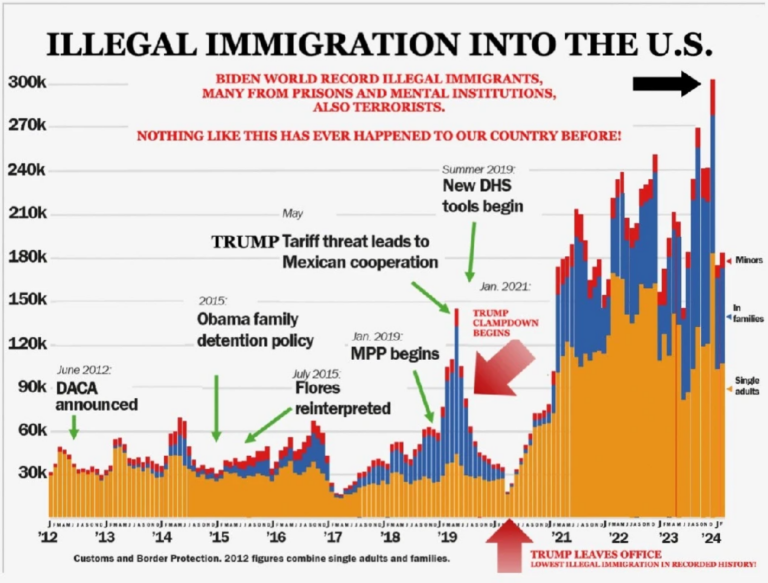
It doesn’t adhere to the principles of graphical excellence, we’ll show you why and provide a better example later!
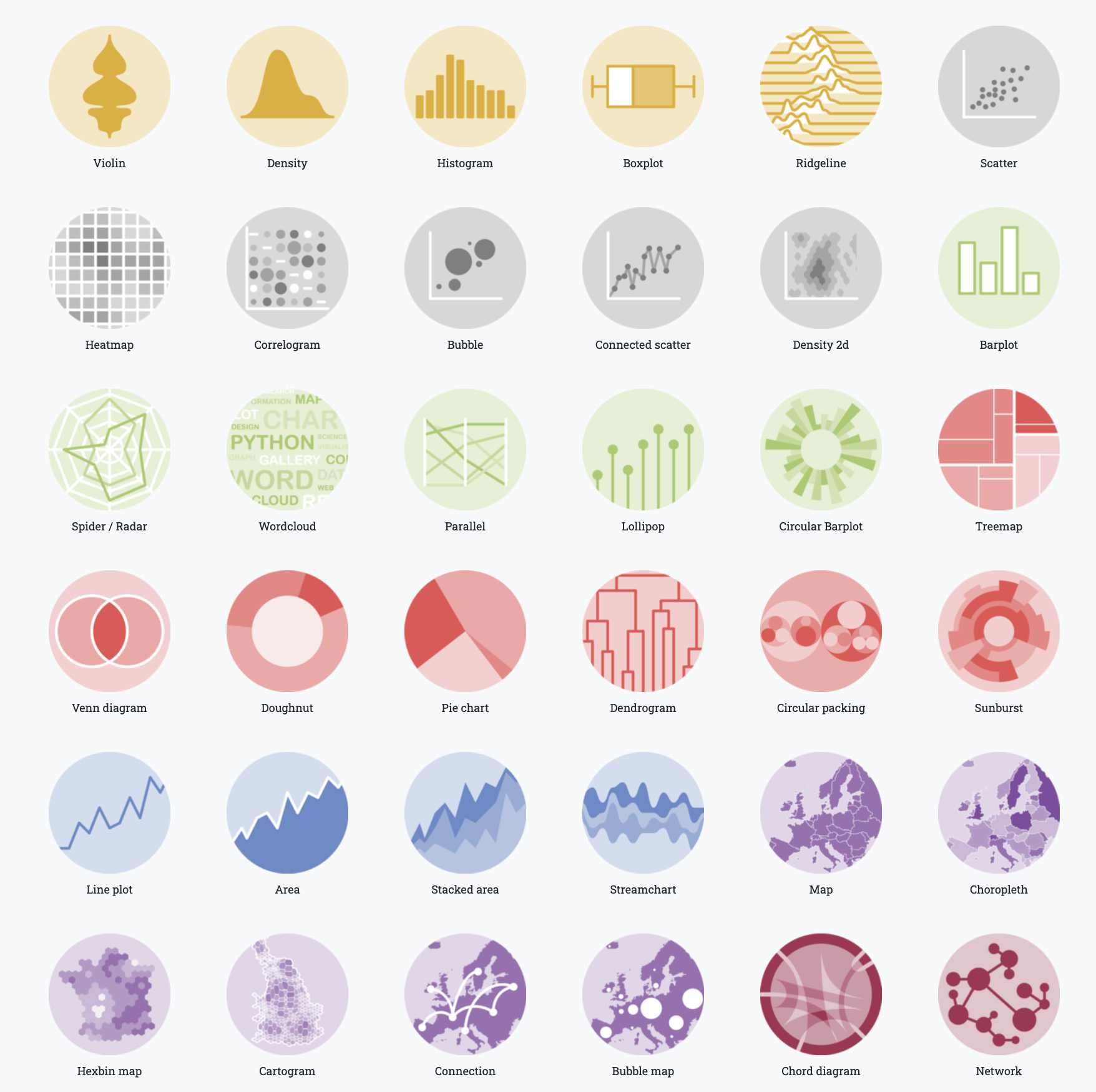
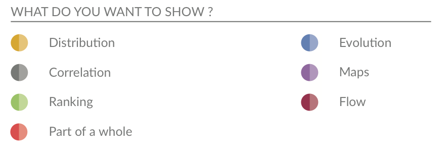
Step 1: Is understanding what your data is.
Step 2: Is understanding what you can show with your data.
Checklist
Make sure you have
Have installed R and RStudio
Are able to set up a Project in R and know why we use them
Can read in data from a file into R
Know how to install packages and load the package libraries
Can assign variables and run basic functions

Social Distancing
A visualisation showing the importance of social distancing (Source).