| Name | DoB | |
|---|---|---|
| Ahmed | 1994/03/01 | ahmed@personal.com |
| Bin | 1954/12/23 | bin@me.com |
| Bin | 1954/12/23 | bin@work.com |
| Carol | 1982/07/16 | carol@mailcom |
ETX2250/ETF5922
Revision
Lecturer: Kate Saunders
Department of Econometrics and Business Statistics
- etx2250-etf5922.caulfield-x@monash.edu
- Lecture 12
- <a href=“dvac.ss.numbat.space”>dvac.ss.numbat.space
Learning Objectives
We’ve covered a lot of topics.
Today will be a highlights tour.
Today’s class
Look at each of the lectures
Pull out some of the key messages
Give you some questions to help you revise for your exam
Week 1
Week 1
Introduction to Data Visualisation
Lecture 1: Getting Started with Data Visualisation
Lecture 2: The Good, the Bad and the Ugly of Data Visualisation
Lecture 3: Data Visualisation in BI
Day 1: Why take this unit?
Importance of Data Visualisation and Communication
Data visualisation is a starting point of every Business Analytics Project.
A picture says a 1000 words: We can turn data into insights using visualisation
Search and show patterns, trends, structure, irregularities, relationships among data
Integral for communicating results from an analysis with clarity and efficiency
Day 1: Learning Objectives
At the end of this unit you will be able to:
Critically evaluate the quality of a data visualisation using the principles of graphical excellence
Successfully create high-quality data visualisations for a given dataset using software, such as Power BI or R.
Develop the skills to effectively use data visualisations to communicate insights to an audience
Develop the skills to effectively use data visualisations to communicate in the appropriate medium, such as report writing, in presentations and digital storytelling.
Apply advanced topics in data visualisation, such as using interactivity and animation to enhance communication.
Day 1: Variable types
Introduction to plots
Different types of variables:
- Discrete
- Count
- Categorical: Ordinal and Nominal
- Continuous
Your turn
Can you think of examples for each of these variable types?
Do you know which variables are visualised best with which plot? (Remember: data-to-viz)
Day 2: Good practice in data visualisation
Tufte’s Principles
- Show the data
- Maximise data ink
- Avoid distorting what the data have to say
- Do not create misleading visualisations
- Present your data in a small space; efficiently with clarity.
- Optimise data density
- Make large data sets coherent
- Use small multiples
- Encourage the eye to compare different pieces of data
- Group your data appropriately
See the ‘The Visual Display of Quantitative Information’ by Edward Tufte.
Day 2: Good practice in data visualisation
Your turn
Can you sketch examples of Tufte’s principles in practice?
Good data-density vs bad data-density?
Good data-ink vs bad data-ink?
If given a visualisation - Can you identify if Tufte’s principles are being used effectively?
Do you understand how to use Tufte’s principles to improve a visualisation?
Day 2: Perceiving visual elements
How the brain processes visual information is essential for creating effective visualisations.
Key elements of human perception
These include:
- Pre-attentive processing
- Visual hierarchy
- Encoding efficiency
- Gestalt principles
- Color perception
- Pattern and trend recognition
- Managing cognitive load
- Cultural and contextual factors
Day 2: Perceiving visual elements
Your turn
Can you describe each of these?
Which ones are most/least effective?
Which visual elements do you notice first/last?
Do you understand how to use these in visualisation?
Day 2: Color Perception
Colour effectivness
Contrast Sensitivity: Luminescence (brightness /transparency) differences are more noticeable than colour differences
Colour scales: Different colour scales are better at representing different types of data
Colourblind Accessibility: Need to choose colour scales that are accessible (colour vision deficiencies in ~8% of men).
Your turn
What colour scales work best for which variables?
Day 2: Bad plots
Bad plots
What makes plots bad can be broadly put into three categories:
- Taste (Aesthetic)
- Perception
- Data
Your turn
Are you confident recognising common pitfalls and identifying features of a bad plot?
Day 3: Power BI vs R
Power BI
Power BI is ideal for day-to-day business reporting.
Pros:
- User-friendly (no programming)
- Easy to create dashboards
- Real-time capabilities, and
- Straightforward sharing
Cons:
- Limited Customisation
- Cost
R
R is great for data scientists and analysts who need in-depth control over visualisations.
Pros:
- Highly customisable
- Suitable for advanced analytics
- Open source (aka. free)
- Automation / reproducibility (more than plug and play)
Cons:
- Higher hurdle to entry - need to code.
- Simple tasks don’t need customisation
Day 3: Power BI vs R
Your turn
Are you clear about which visualisation tool is best for the job? e.g. For what tasks would you use R vs Power BI?
Do you know how the different variable types are stored by a computer in both R and Power BI?
Day 3: Polishing you visualisation
When you are happy with the plot you’ve chosen for your data it is time to polish the plot.
Steps
- Update all the plot labels
- Title, axes labels, tick labels, legend text etc.
- Use intuitive and intelligent labels
- You must include units where relevant
- Ensure the text size is readable!
Day 3: Polishing you visualisation
Steps
Chose an appropriate colour scale
Align your visual elements in your plot for clarity
- e.g. Think about legend position
Check the final plot conveys the message you intend
- Be sure your plot proportions are good
- Check the range on your axes
May like to add additional text or colour to draw the eye to important parts of the plot you want to highlight
Your turn
If I give you a plot, could you describe what steps needs to be done to polish it?
Day 3: Plot types
Plot types
Covered different types of plots:
Pies, Donuts
Bars: Stacked, Clustered, Percentage
Treemaps
Gauges
Maps
Your turn
Do you know when to use each plot type and when not to use each plot type? (Remember: data-to-viz)
Week 2
Week 2
Visualisation in R
Lecture 4: Visualisation in R: Plots of 1 - 2 Variables
Lecture 5: Data Wrangling in R
Lecture 6: Visualisation in R: Plots of 2 or more Variables
Day 4: Grammar of Graphics
Key ggplot layers include:
- Data:
- The dataset you’re visualising.
- The dataset you’re visualising.
- Aesthetic Mappings (
aes()for short):- Map variables to visual properties like x, y, color, size, etc.
- Map variables to visual properties like x, y, color, size, etc.
- Geometries (
geom_*):- Define the type of plot (e.g., bars, lines, points).
- Scales:
- Control how data maps to aesthetics (e.g., axis limits, color gradients).
- Facets:
- Split the data into multiple panels (e.g.,
facet_wrap()).
- Split the data into multiple panels (e.g.,
- Themes:
- Customise the non-data components (e.g., background, grid lines).
Day 4: Grammar of Graphics
Your turn
- If you were asked to describe a plot, can you use the grammar of graphics to explain each layer?
Day 4: Plot Types
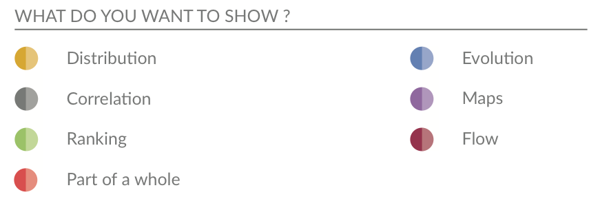
Distribution: Box Plots, Histograms, Density
Relationships/Correlations: Scatter Plots, Heat maps
(Previous week: Ranking, Part of a whole.)
Day 4: Plot Types
Your turn
Do you know what plot types work best to show different details, eg. distribution or ranking etc?
If I give you a variable or variables, can you tell me how to visualise them?
Day 5: A few simple functions
Transforming your data
Much can be done with a few simple functions from the
dplyrpackage:- Choose variables with
select - Choose observations with
filter - Transform variables with
mutate
- Choose variables with
In all cases both input and output is a data frame.
Your turn
Can you explain the common commands we use in R to wrangle data?
Can you use logical statements to filter your data (==, %in%, != etc)?
Do you know the operators (&, |) for combining logical commands together?
Day 5: First Normal Form
Remember database normalisation:
Deepal can be added as
| Name | DoB | |
|---|---|---|
| Deepal | 1987/04/23 | deepal@work.com |
| Deepal | 1987/04/23 | deepal@me.com |
| Deepal | 1987/04/23 | coolgirl87@me.com |
Your turn
Can you explain why we want our data in this form?
Day 5: Reshaping and Joining
Other tidy functions
Reshaping functions:
pivot_longer“lengthens” data, increasing the number of rows and decreasing the number of columnspivot_wider()“widens” data, increasing the number of columns and decreasing the number of rows.
Joining functions:
Matching observations from two different data frames using common column names.
There are four mutating joins: the inner join, and the three outer joins.
Day 5: Reshaping and Joining
Your turn
Are you clear about why we may need/want to reformat our data for plotting?
If given raw data and a polished plot, would you know what steps to take to reformat/tidy the data to produce the plot?
Day 6: Higher dimensions
Visualising in higher dimensions
- Know how to create small multiples using facets
facet_wrap()facet_grid()
- We learnt how to create quick visual summaries
- Displaying multiple dimensions
- Using the pairs plot (
ggpairs)
- We also covered how to combine multiple plots together into a single panel
- Using the
patchworkpackage
- Using the
- Learnt how to use
groupto create multiple version of a geometry o na single plot
Day 6: Higher dimensions
Your turn
If given a data set with lots of variables, can you generate quick visual summaries?
Do you know how to use small multiples to show more dimensions in your data?
Do you know when it is appropriate / best to use small multiples?
Week 3
Week 3
Language of Visual Communication
Lecture 7: Iterating your Plot Design
Lecture 8: The Art of Visual Storytelling
Lecture 9: Guest Lecture by digital journalist: James Goldie
Day 7: Iterating on your data visualisation
The facts:
The first plot you create will almost never be the plot you use
Visualising data is not a linear process!
You’ll take 2 steps forward, 1 step backwards and another sideways before you produce your final plot
You’ll also need to create many, many visualisations, before you finalise a visualisation
Visualising data is an iterative process
Day 7: The cycle
Data visualisation is a key part of the analysis cycle.
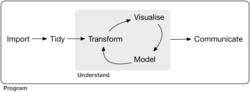
Figure is from R for Data Science Textbook 2nd Edition.
Your turn
Do you know how many iterations is normal before finalising a plot design?
Day 7: Learning about the data
Looking at the data summary only gets you so far.
We should visualise the data!
Visualisation helps us to
- to explore
- to understand, and
- to answer questions
about our data.
Why we visualise?
Visualisation for exploration (to understand and identify important features in the data), and
Visualisation for communication (to communicate your understanding to others)
Day 7: Learning about the data
Your turn
What might you be looking for when doing an exploratory analysis?
If given a data set could you explain where you would start when doing an exploratory analysis?
Can you explain the difference between exploratory visualisation and iterating on your design create a final plot?
Day 7: Describing a plot
Note
Start with a one sentence summary of the main point the plot is trying to communicate.
Then describe the different features of the plot.
Next follow with other observations/secondary points
And lastly any constraints or cautions on interpretation
Your turn
For given a plot, could you confidently write a description?
How does accessibility feature when captioning a plot?
When should one think about key messages in iterating on your plot design?
Day 8: Communication competence
Important
There is no single, ideal way to communicate
Good communication is situational and relational
Relies on understanding the where, what and who
Or in other words: Medium, Message and the Audience
Your turn
Do you know how to tailor a visualisation for the audience, message and medium?
If the situation or audience changes, could you explain how you would change your visualisation?
Communication outcome
Also important to think about what you want the outcome of this messaging to be.
Important
How do you want your audience to use or respond to those messages?
- Inform: Update their understanding
- Persuade: Change their behaviour
- Inspire: Help people think differently
- Instruct: Teach how to do something
- Entertain: Engage and have fun
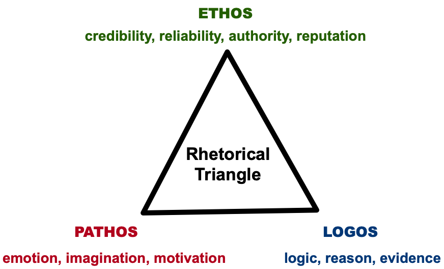
Rhetorical Triangle
Your turn
- Can you explain how the rhetorical triangle is used in effective communication?
Your turn
Your turn
Do you understand the different types of communication?
How can human perception be used for effective communication?
There was a lot in this lecture!
Day 9: Building your Data Narrative
Building your Data Narrative
Learnt more about different modes of delivery (presentations, reports, blogs)
Covered practical aspects of tailoring our communication:
- For the audience (how to keep them engaged)
- For the medium (structure)
- For the length (how many keep messages)
This included how human perception can be used in slide design
Your turn
For a medium of a given (e.g. presentation, report):
- Do you know the basic structure?
- Do you know how many key messages are appropriate?
Day 9: Quarto and Reproducability
Quarto
Covered the basics of reporting using Quarto
Quarto provided a flexible and reproducible way to keep your analysis and reporting together.
You can combine text, code and visuals in document
Can export your analysis to word, pdf, slides and html
Your turn
Do you understand what a code chunk is?
Can you change code chunk options so your code shows or is hidden?
Can you combine text, code and visuals and export to word or pdf formats?
Day 9: Building a Data Narrative
Building your Data Narrative
Important to effective communication is how you build the data story
In it’s most basic form its how you structure you slides or report, but good communicators do more than just this.
You must think about your key messages and the order you present them
Day 9: Scrollytelling
Scrollytelling
Scrollytelling is a way to create a layered data narrative
Build the details sequentially and alongside the audience’s understanding
Great tool for controlling for cognitive load and the speed of the messaging
We learnt how to create a data narrative, specifically scrollytelling, in R using the
closereadpackage
Your turn
If you have a series of key messages:
- Are you able to order them?
- Can you layer the detail in a way that will make sense to your audience?
Week 4
Week 4
Advanced Topics in Visualisation
Lecture 10: Infographics
Lecture 11: Interactivity and Animation
Lecture 12: Exam Revision
Day 10: Infographics
Infographics
Making complex data accessible, memorable, and engaging. They are:
Visual representations of data that combine graphics, text, and numbers.
Go beyond just visualisation
Guide the reader to the key messages
Messages are often in a simple, narrative form
Use human perception to reduce the cognitive load.
Your turn
When should we add narrative elements to plots to create infographics?
How do we tell if a narrative elements is effective and not just chart junk?
Day 10: Communicating uncertainty
People and probabilities
People struggle with probabilistic reasoning, preferring definitive answers instead of ranges or likelihoods.
Understanding probabilities requires numerical literacy, which varies widely among the public.
Probabilities and uncertainties when given as numbers alone often are abstract.
Your turn
- What are effective ways to visualise uncertainty?
Day 10: Missingness
Note
Understanding what data is not there and why is very important
Missing data or incomplete data can lead to a wrong conclusion
Visualising what is missing is important!
Remember the different types of missingness: MCAR, MAR, MNAR.
Your turn
Can you explain the different types of missingness and give examples of each?
When can I ignore missing data?
Day 11
Important
This lecture was for fun!
I’m not going to examine you on this on your exam.
Day 11: Interactive Visualisation
Definition
Data visualisation that is directly manipulated and explored through user input.
Why
- Connect people and data
- Make the system playful
- Prompt self-reflection
- Personalise the view
- Reduce cognitive load
Day 11: Quality Criteria
Expressiveness (Mandatory Condition)
An interactive visual representation is expressive if it allows the user to carry out the actions needed to acquire the desired information in the data.
Effectiveness (Goal-Oriented Condition)
A measure of how well the user can convey an interaction intent to the computer.
Efficiency (Desired Condition)
The balance between benefits and costs of using interactive visualisation.
Day 11: Animation
Why?
- Add another dimension.
- Provides a more compact delivery of information.
- Allows for guided exploration of data, great for talks.
- Capture the audience’s attention.
Day 11: Interactivity and Animation
Your turn
When should I be using interactive graphics and animation to enhance my visualisation / communication?
What makes an interactive visualisations good?
What kinds of user inputs are common in interactive visualisations?
What types of animations suit different types of data?
Summary
Wrap Up
Today was a highlights tour! Be sure to revisit the slides and lecture recordings to get into the details.
For your study: Bloom’s Taxonomy of Learning
Remembering
Understanding
Applying
Analysing
Evaluating
Creating
My focus will be on examining the last 3 bold tiers.

ETX2250/ETF5922