The following is a past exam question. That provides an exam of how to complete the tutorial exercises.
Question
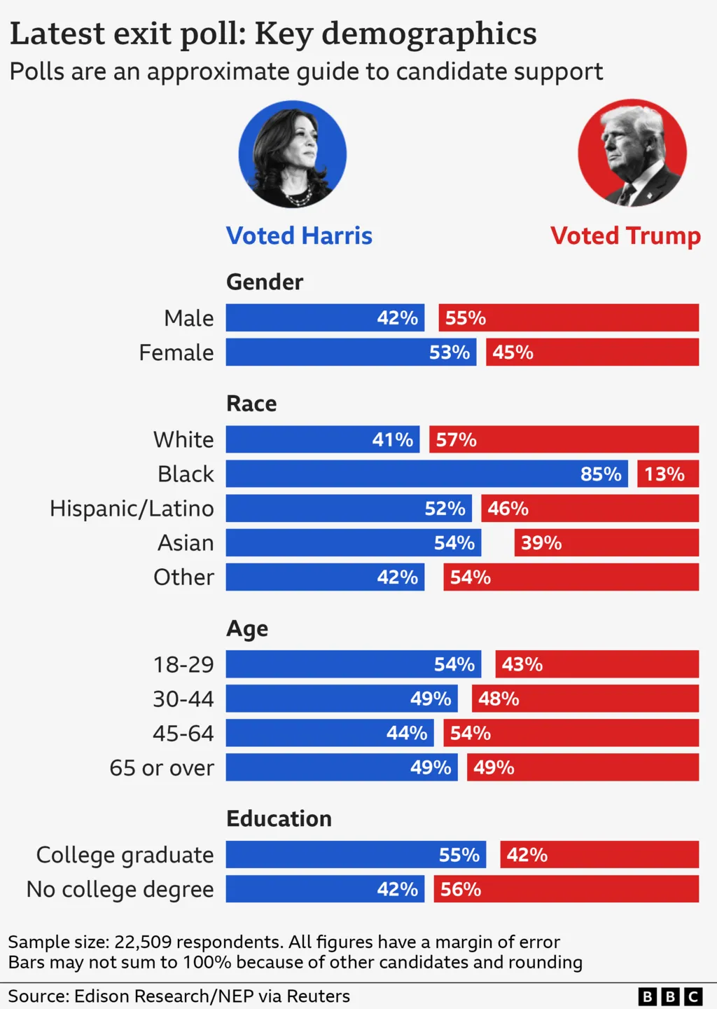
The following visualisation was created by the BBC to help online readers’ understand how the USA voted in the recent election.
Explain why this an effective data visualisation using the principles of graphical excellence. You should reference both Tufte’s principles and elements of human perception in your answer.
For full marks students must mention intuitive colour scale, use of gestalt principles, comment upon tufte’s principles and the elements of human perception (or equivalent).
They might comment of the following:
This visualisation uses an intuitive colour scale that matches the political parties. (Human Perception: Cultural factors)
Variables are positioned closer together to suggest they belong in groups and encourage comparison (Gestalt principle of proximity)
Variables are positioned under different subheadings to show groups (Similar to Gestalt principle of enclosure)
The use of space is effective, with the bar charts a suitable geometry and clear and easy to read labels. (Data-density is well optimised)
The geometry is a percentage stacked bar chart that allows easy comparison across the different variables even though they all would have different totals. (Highly effective way to show the data)
The photos could be considered chart junk, but in this case enhance contextual understanding (Data-to-ink ratio, Cultural Factors)
Using different weights for the sub-headings and titles effectively draws the eye to the important information (Use of visual hierarchy)
We are easily able to compare who got more votes across the categories by comparing bar length (Uses an effective visual encoding)
The data is grouped into small multiples (Gender, Race, Age, Education) for easier display of the large dataset (Tufte’s principles)